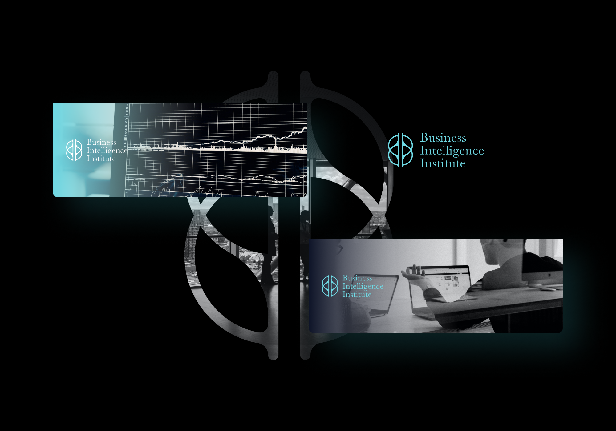
Business Intelligence Institute is a communication expert that deals with digital marketing and team development. I was approached by its founder with an idea of a rebrand and a need for social media assets.
The old logo.
The first task we needed to deal with was the redesign of the old logo. We needed to keep the name and an illustration of the brain in the redesign. Everything else was up for editing.
The idea.
This was not just an Institute branding.
It needed to cover the magazine that was in the plan - Business Intelligence Review, the members association - Club, as well as the offline event that is at this point still in the initial phase of development - Forum.
Therefore, I needed a branding system that could be easily applied to different sub-brands that were known at the moment and others that were yet to come.
That is why I based the brain on the typographic portion of different names, each one represented by the Business hemisphere - “B”, and R, C, and F for Review, Club and Forum, which are connected by invisible “I” for intelligence.

Typography
The next step was to figure out what typography fits, and I went along with a classic serif type that pulled back the very modern sign to a more professional-looking logo to represent the Institute in the best way possible.
Colors
The brand was developed under a single palette, but once we got to a point of planning a magazine, the client and I agreed upon a new color for the print, so we reevaluated the color scheme. There were a couple of further instances where we had to do the same, so this portion actually took quite some time. In this showcase, I am only presenting the colors and applications on which the client agreed upon.
Business Intelligence Institute.
General social media assets and header templates.

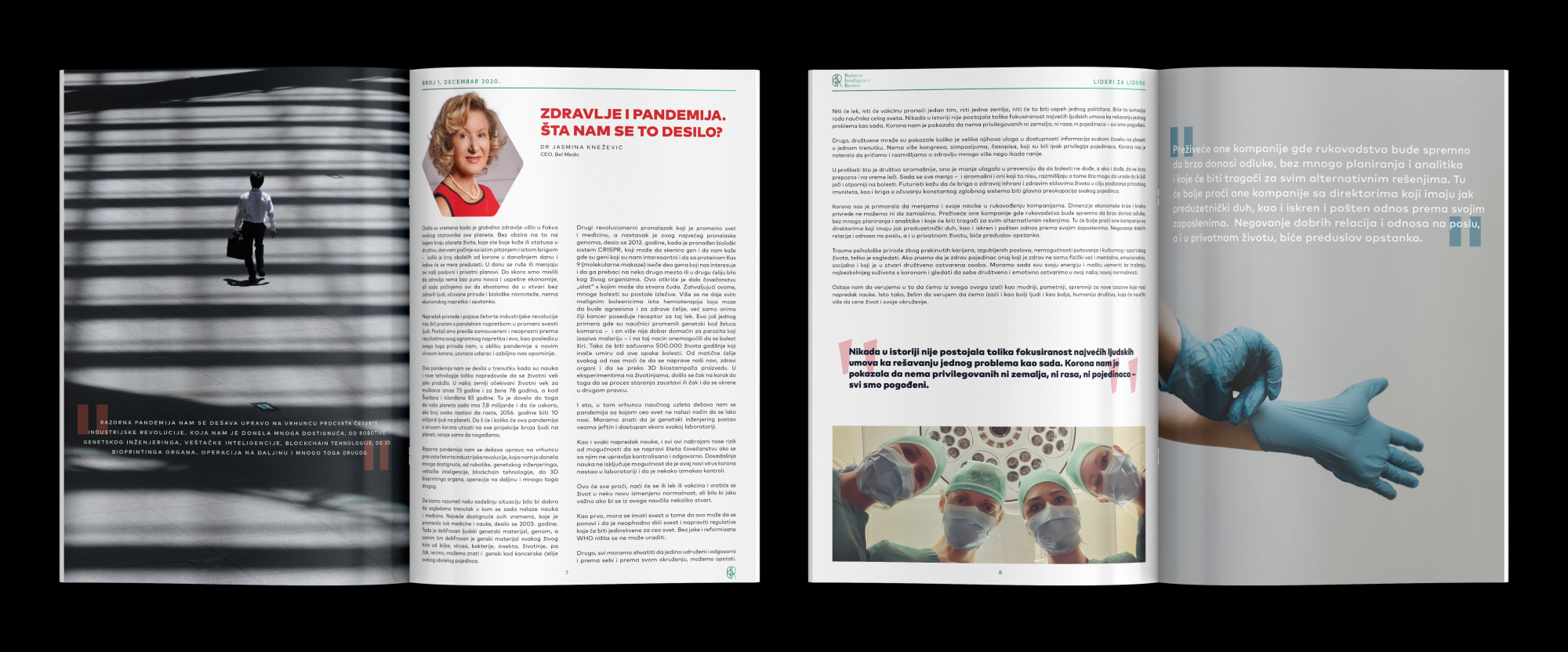
Business Intelligence Review.
The first and second printed edition of the Review magazine, selected pages.

Business Intelligence Club
All of the material created for the Club is made out of sensitive information, so those will not be showcased in this project.
Business Intelligence Forum
The Forum is still in the making and the first event should be held later this year.
This is an ongoing collaboration with a reliable and long-term client from Belgrade, Serbia.
For more information about them and their services, check out their website - bii.rs


