

Aero - Traffic signage branding system
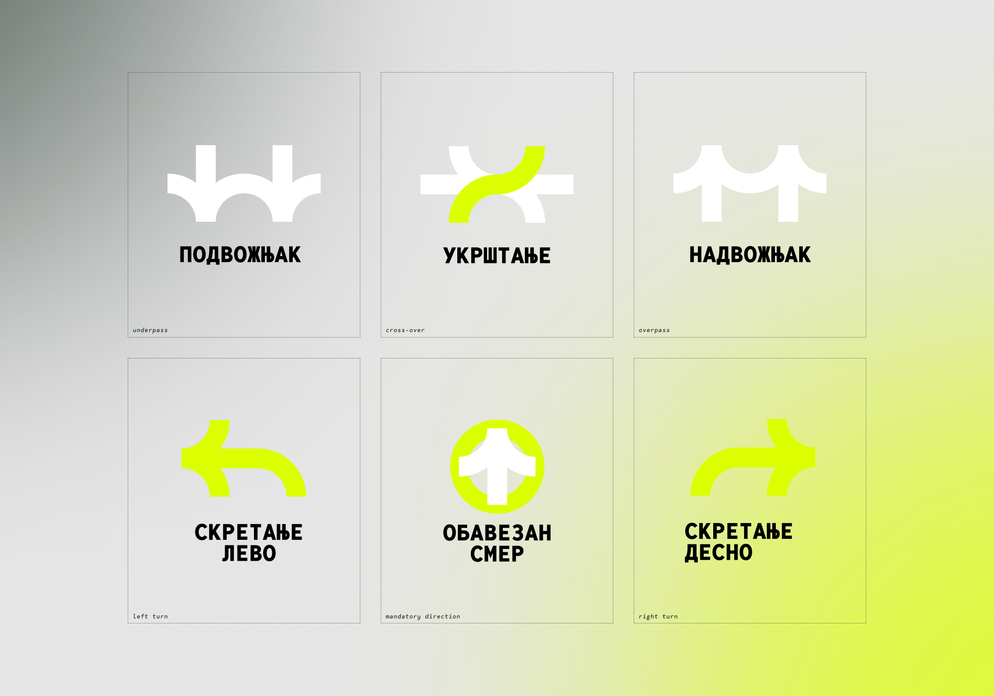
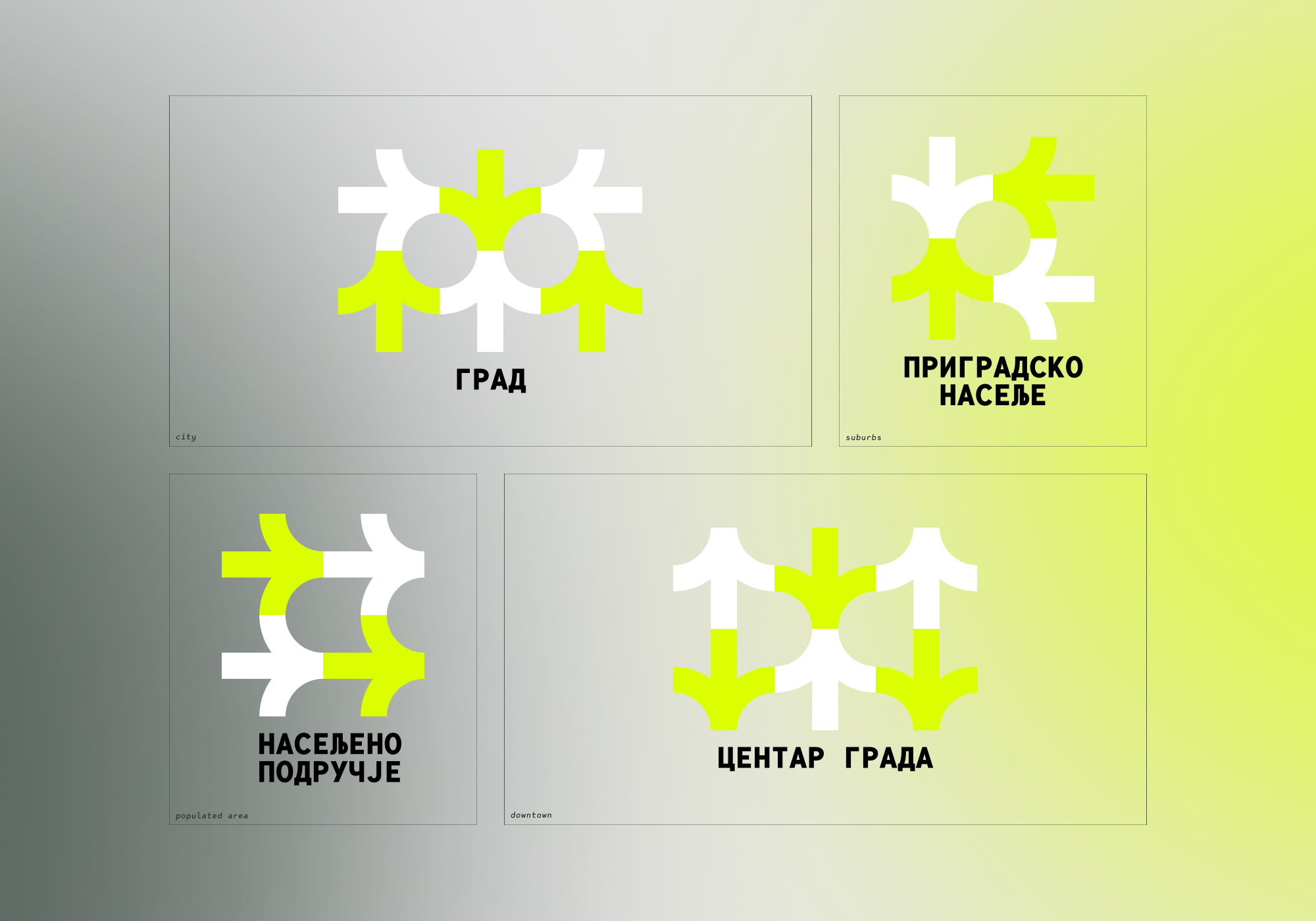
aero is a branding system idea for a series of road signs. Its sole purpose is to test out how a design system could be made functional by utilizing as few building elements as possible.
For this idea, I wanted to play around with a bold arrow as the primary element, with an addition of a circle as the second element in some instances.
Using these, I developed a few pictograms that take advantage of this dual-element system.

Further playing around led to developing icons to represent different road sections and rules of behavior. Multiplying these was a lot of fun, but I forced myself to stop at some point since my only rule for this project was a time limit of up to a day for the whole idea development and project implementation.

Road signs.
After the icon development, I wanted to test out different applications to road signs and formats, make them visible, highlighted, but fairly more modern than we’re used to.


I gave myself a time limit of a single day and a creative challenge to develop this branding system. Its sole purpose is to test out how a design system could be made functional by utilizing as few building elements as possible, as well as test my output under a strict time limit.